import matplotlib.pyplot as plt
import tqdm.auto as tqdmExample
Showcasing the awesome stuff made possible by
boopiter
Plots
Hey, could you generate some really brief simple code that would plot a 2D heat map with contour lines for some function you might make up? Matplotlib is fine.
🤖Reply🤖
Reply details
- Model: qwen2.5-coder:latest
- Finish reason: stop
- Tokens: 1204 prompt + 244 completion = 1448 total
Certainly! Here’s a snippet of Python code that generates a 2D heatmap with contour lines using Matplotlib:
import numpy as np
import matplotlib.pyplot as plt

# Define the function to plot
def f(x, y):
    return np.sin(np.sqrt(x**2 + y**2))

# Generate data
x = np.linspace(-5, 5, 100)
y = np.linspace(-5, 5, 100)
X, Y = np.meshgrid(x, y)
Z = f(X, Y)

# Create the plot
plt.figure(figsize=(8, 6))
plt.contourf(X, Y, Z, levels=20, cmap='viridis')
plt.colorbar(label='f(x, y)')
plt.contour(X, Y, Z, colors='black', levels=10)
plt.xlabel('x')
plt.ylabel('y')
plt.title('2D Heat Map with Contour Lines')
plt.show()
This code defines a simple function f and then uses Matplotlib to create a heatmap of this function along with contour lines. You can run this in your Python environment to see the plot.
import numpy as np
import matplotlib.pyplot as plt

# Define the function to plot
def f(x, y):
    return np.sin(np.sqrt(x**2 + y**2))

# Generate data
x = np.linspace(-5, 5, 100)
y = np.linspace(-5, 5, 100)
X, Y = np.meshgrid(x, y)
Z = f(X, Y)

# Create the plot
plt.figure(figsize=(8, 6))
plt.contourf(X, Y, Z, levels=20, cmap='viridis')
plt.colorbar(label='f(x, y)')
plt.contour(X, Y, Z, colors='black', levels=10)
plt.xlabel('x')
plt.ylabel('y')
plt.title('2D Heat Map with Contour Lines')
plt.show()
<ipython-input-1-6356375be1f3>:22: UserWarning: FigureCanvasAgg is non-interactive, and thus cannot be shown
plt.show()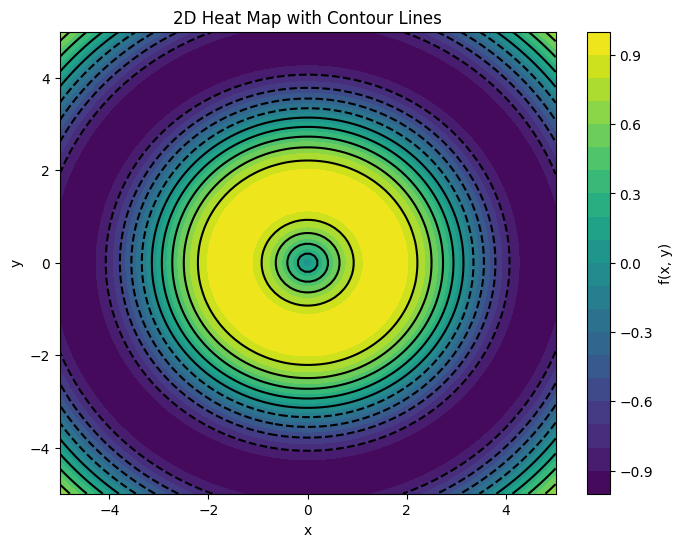
Progress Bars
We can only use the regular TQDM as if we were in a terminal because the notebook version requires IPy widgets that I’m not going to implement
from tqdm import tqdm
import time

for i in tqdm(range(1000)):
    time.sleep(0.01)  # Simulate some work being done
100%|##########| 1000/1000 [00:13<00:00, 72.47it/s]Notice how the notebook version isn’t going to increment. So be aware.
from tqdm.notebook import tqdm
import time

for i in tqdm(range(1000)):
    time.sleep(0.01)  # Simulate some work being done
0%| | 0/1000 [00:00<?, ?it/s]…See it just sits there and does nothing. So don’t try to use the notebook version.
Good news is, if you just use the auto version of TQDM, you get the regular text version:
from tqdm.auto import tqdm
import time

for i in tqdm(range(1000)):
    time.sleep(0.01)  # Simulate some work being done
100%|##########| 1000/1000 [00:12<00:00, 82.16it/s]Which variety of which LLM are you?
I’m wondering if you could give me a little code that would generate like a 3D scatter plot in Plotly that I can test here in this Boopiter notebook. I suppose I’ll have to render it via the IPython display HTML element, so give me your best guess at what that needs to look like. And please conform to my coding style of keeping everything as vertically compact as possible so that I don’t have to scroll up and down much to see the full code
import numpy as np, plotly.graph_objs as go
from IPython.display import display
np.random.seed(42); n = 100
x, y = np.random.rand(2, n)*2 - 1; z = np.hypot(x, y)
fig = go.Figure(go.Scatter3d(x=x, y=y, z=z, mode='markers',
    marker=dict(size=5, color=z, colorscale='Viridis', opacity=.8)))
fig.update_layout(title='3D Scatter', margin=dict(l=0, r=0, b=0, t=30),
    scene=dict(xaxis_title='X', yaxis_title='Y', zaxis_title='Z'))
h = fig.to_html(include_plotlyjs='cdn', full_html=True).replace('&','&').replace('"','"')
display({'text/html': f'<iframe srcdoc="{h}" width="100%" height="500" style="border:none"></iframe>'}, raw=True)
^^Go ahead! Manipulate that plot with your mouse. Press & drag, zoom in, etc.